All posts by Jo Angela Oehrli

About Jo Angela Oehrli

Jo Angela Oehrli is a Co-PI of this IMLS-funded project and a Learning Librarian at the University of Michigan Library.

Data of the Day: Example Infographics from Statista

10012162166_bdba011392_h

If you would like to find example infographics, Statista — even the open, non-licensed-version of Statista — has many here.   There’s lots to talk about with these images!  And, who knows??!!  Your students may even want to use the data on these pages for their research projects.

As an example, see The Unrelenting March of Diabetes below.  I was surprised to see Russia included in the European Region.   Note also the interesting use of color and size in the chart below.    Think of the size of the circles in relation to the geographic area they represent.   Now look at the percentage in the circles.   You can barely see the map of the Eastern Mediterranean Region underneath a 13.7% circle.  The percentage listed does not really match how much space it takes up on the maps of the different regions — but we would expect that there would be some sort of relationship there.  The relational size is actually in “mapping” the red circles and orange circles to each other.  If they had made the circles any smaller in order to show the geographic relationships, we probably couldn’t read what was in the circles!

Infographic: The Unrelenting Global March Of Diabetes | Statista
You will find more statistics at Statista

And, please know, there are a lot of amazing infographics at Statista — Some really good ones!  Check it out!

Image:  “World Map: Abstract Acrylic” by Nicholas Raymond on Flickr http://flic.kr/p/gfJWZC and http://freestock.ca/ CC BY 2.0


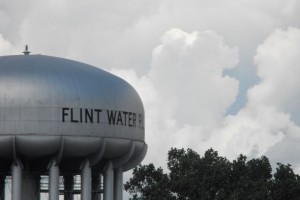
Data and the Flint Water Crisis

What's behind Flint Water Crisis?

This week I worked with U-M Library’s Emergent Research Committee to bring Marty Kaufman to the library.  He talked about the data gathering that he’s been doing to help map the locations of lead pipes in Flint’s water system.  For more on his talk see Patricia Anderson’s great Storified version  or the MLive coverage of his presentation.

Whenever I mention the Flint Water Crisis to students they become really engaged.  My colleagues and I are using the information about this issue to discuss things like the nature of authority in informational sources (“Authority is Constructed and Contextual” for my academic librarian peeps), and students seem to really catch on.  I talked with my advanced research students yesterday about the crisis, and I didn’t have to remind them in any way about what’s going on.  And just the other day, my 24 year old nephew mentioned that he had stayed up until midnight to watch the Flint Water Crisis Congressional hearings.  He says that sometimes watching election coverage seems like he’s watching some kind of movie.  But what’s happening in Flint seems “real.”

Granted, what’s happening in Flint seems very local in my community.  And the governor lives in Ann Arbor when he’s not in Lansing.  I don’t want to seem like I’m looking at what’s happening in just a clinical, removed kind of way.   This issue resonates with so many people.  And there’s a very data-related component to what’s happening.

In his presentation, Marty talked about how he and his team had to go through thousands of penciled index cards (“big” data) to determine where lead pipes are located.  He said that it’s difficult to get a clear sense of where things are because of unclear index cards (data) — yet they have to draw some kinds of conclusions.  Based on the data that they’ve gathered, the team is going to have to use predictive models to determine the likelihood of where lead pipes might be in places without clear index cards.

When asked what the general public should do, Marty made a clear case for all of us to become data collectors — He told us to look for lead in the water systems, paint, and toys within our own homes (a place where lead might be impacting all of us the most!) and record it accurately and PERMANENTLY (don’t use pencil!).  Somehow, if we can all gather this kind of data and pool our information, we can better address the serious issue of how lead exposure can impact our lives.

One of the most striking images in Marty’s presentation is the image of  undergraduates working in his GIS lab, many of them Flint-area residents.  Marty says that he had to kick the students out at the end of the day because they were so invested in their work.  Understanding that data comes from “somewhere” and that having good data can make a real impact on your life is a huge motivator.   Data and data literacy matter.

Photo: Ben Gordon, CCBY-NC-SA 2.0

Holistically Integrating “Real Math” into the Curriculum

Calculus Image

“Andrew Hacker, a professor of both mathematics and political science at Queens University has a new book out, The Math Myth: And Other STEM Delusions, which makes the case that the inclusion of algebra and calculus in high school curriculum discourages students from learning mathematics, and displaces much more practical mathematical instruction about statistical and risk literacy, which he calls “Statistics for Citizenship.””

Andrew Hacker has an intriguing idea that the high school math curriculum needs to be radically re-examined.   And, no … He’s not talking about Common Core!  What if we didn’t teach Algebra II and Calculus in high school and instead taught, “Statistics for Citizenship?”  Would there be less math anxiety for students?  Would lessening the requirements for some professional training , like EMT training, open professional doors and expand the workforce?  Would students be more statistically literate and better citizens?  Would we finally be able to answer the age-old, high school question, “When am I going to use calculus in real life?”  (And just to be clear … I LOVED math in high school and took every math class that I could!).

Hacker is advocating that teaching statistical literacy explicitly in a classroom devoted to these concepts is better than dedicating part of the day to teaching advanced math.  Statistical literacy is one of the main concepts of the grant this year.  Overall, I’ve really struggled with looking at how teaching data literacy can be holistically integrated into the curriculum.  I want our work to be useful and successful so implementing it is always on my mind

School librarians present an interesting model for holistic integration of any curricular change.  While some teachers think that librarians are only working with English or Social Studies teachers, school librarians can work with any teacher — Some work with Health teachers as students create posters representing good health practices.  Others work with science fair participants to create solid ideas around the practical application of scientific concepts.  The list goes on and on.  As one of our Library Development Officers used to say to potential donors, “The Library is for Everybody.”  Having a separate statistical literacy class flies in the face of having students see how any information literacy concept is integral to the rest of their work as they encounter the practical application of these ideas throughout their day.

Dedicating part of the day to statistical literacy is intriguing to me.  Having a class like this occupy some of the day’s “real estate” would send a signal that statistics for citizenship is important for our children … Yet … I always wonder about the holistic aspect of separating out overriding conceptual ideas into their own place in the curriculum.  I struggle with this separation in teaching information literacy too — Why can’t info lit be more grounded into the rest of the curriculum, especially at the college level?  I’m not sure that I know the answers to these questions.  Maybe we could find a thematic approach — Students could have a separate class AND apply statistical literacy ideas in science, English, government, and other classes.  Is that asking too much?

Image:  “Calculus” by fitriahandayani on Flickr. CC-BY-2.0. https://flic.kr/p/9yZ1rp

The Polling Rodeo: Predicting Election Results and Democracy

By Billy Hathorn (Own work) [CC BY 3.0 (http://creativecommons.org/licenses/by/3.0)], via Wikimedia Commons

“While Mr. Sanders led New Hampshire polls for the last month, and Mr. Trump was ahead here since July, the wave of support for both men was nonetheless stunning to leaders of both parties who believed that in the end, voters would embrace more experienced candidates like Mrs. Clinton or one of the Republican governors in the race.”  — New York Times, 2/9/2016   http://www.nytimes.com/2016/02/10/us/politics/new-hampshire-primary.html

“Donald Trump was at the top of each of the last 10 polls in Iowa, but his lead failed to hold up on caucus night Monday. In the end, his seven-point lead in polling averages amounted to a three-point loss to Ted Cruz.” — New York Times, 2/2/2016, http://www.nytimes.com/2016/02/03/upshot/polls-were-way-off-on-donald-trump-heres-what-it-means.html?partner=rss&emc=rss&_r=0

“Imagine that you’re a member of Congress, I said, and you’re about to head into the House to vote on an act—let’s call it the Smeadwell-Nutley Act. As you do, you use an app called iThePublic to learn the opinions of your constituents. You oppose Smeadwell-Nutley; your constituents are seventy-nine per cent in favor of it. Your constituents will instantly know how you’ve voted, and many have set up an account with Crowdpac to make automatic campaign donations. If you vote against the proposed legislation, your constituents will stop giving money to your reëlection campaign. If, contrary to your convictions but in line with your iThePublic, you vote for Smeadwell-Nutley, would that be democracy?” — The New Yorker, 11/16/2015, http://www.newyorker.com/magazine/2015/11/16/politics-and-the-new-machine

So … It’s been an interesting week (or year!) for polling and predicting who will be President.  One of the reasons that the grant team felt like the time was right for providing data literacy, professional development to librarians was because of the election in the not-too-distant future.  Interpreting polling data is vital to helping our students become informed citizens.

Why do polls “get it wrong” or surprise people?  Charles Wheelan In Naked Statistics (one of our “homework books” ) does a great job explaining where things can go wrong in polling.  In addition to the points made by Nate Cohn  from the New York Times regarding who is taking the polls — flawed voter models, unrepresentative samples, the influence of late-breaking events — Wheelan encourages us to look closer at the questions and answers in these surveys …

  • Have the questions been posed in a way that elicits accurate information on the topic of interest?
  • Are respondents telling the truth?

When so much seems to be riding on perception in this election (look at what happened in the Midterm election and how people’s perception of the economy informed how they voted), opinion polls matter.  Jill Lepore writes in the New Yorker that “Polling may never have been less reliable, or more influential, than it is now.”  The public relies on the media to provide them with a good sense of what’s going on in the world.  Data science paired with data literacy skills can do that.  Misinterpreted survey data or polls conducted unethically leads people to draw conclusions that may just reinforce partisan beliefs (again, see what happened in the Midterms).

Yes … I know … There are whole graduate programs devoted to the methodology of conducting surveys — Programs that might cover how to conduct good opinion polls!  But in this wild rodeo of an election where BOTH sides have voters who are bull-headed, I think teaching high schoolers to ask basic questions like “Who is answering the questions in this survey?” and “How might  the format of this question influence the answer?” are good strategies as they move forward to become informed citizens and not just partisan, rodeo clowns.

Image:  File:Post, TX, Stampede Rodeo stadium IMG 1722.JPG by Billy Hathorn on Wikimedia Commons.  CC BY 3.0.