
Congratulations to co-PI Angie Oehrli!
Congratulations to our co-PI Angie Oehrli, who has been chosen to receive 2017’s LIRT Librarian Recognition Award.
The Library Instruction Round Table (LIRT) of the American Library Association has chosen Jo Angela Oehrli, Learning Librarian at the University of Michigan, Shapiro Undergraduate Library as the 2017 recipient of the LIRT Librarian Recognition Award. The Librarian Recognition Award was created to recognize an individual’s contribution to the development, advancement and support of information literacy and instruction. Oehrli was chosen as the 2017 winner based on her contributions at the national, state and local levels in support of information literacy and instruction. The award will be presented to Ms. Oehrli as part of the LIRT 40th Anniversary Celebration on Saturday June 24, 7-9 PM … during the ALA Annual Conference in Chicago.
Michael Saar, chair of the 2016 Awards Committee, noted Oehrli’s extensive leadership in promoting information literacy, program creation and her strong publication record as determining factors in the committee’s selection of her as this year’s winner.
Congratulations, Angie!
Image: Public domain from Pixabay.com
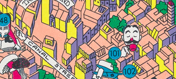
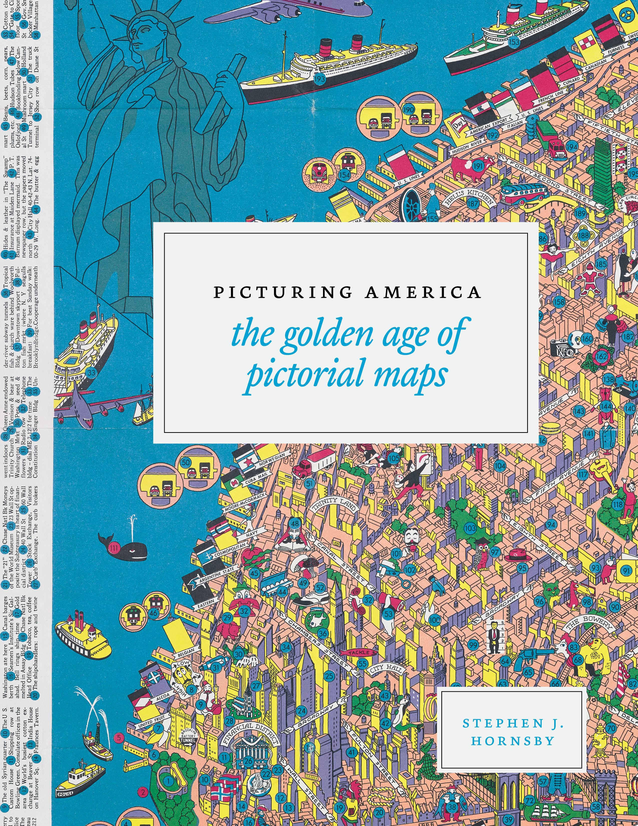
New Book: Picturing America: The Golden Age of Pictorial Maps
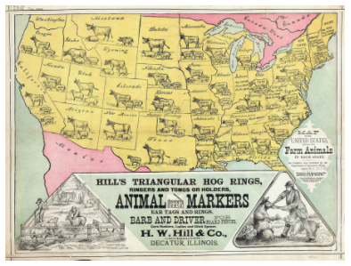
H.W. Hill & Co., Map of the United States, Showing the Farm Animals in Each State. 1878. Public domain. Image courtesy to the book by Rare Maps Inc.
Maps are a powerful, time-honored method of data visualization. And pictorial maps are even more fun, because they often superimpose iconography that represents the points of pride, natural wonders, exports, traditions, even the location of bathrooms. Think of historical maps complete with sea dragons or the state maps from the state reports of our youth, decorated with cars and sheaves of wheat.
The Library of Congress and the University of Chicago Press have a new book out to celebrate the decorated maps of our nation. Picturing America: The Golden Age of Pictorial Maps, was out this week, and just from the cover (below and in featured image) and preview pages I saw, I know I’m going to be hooked on these as soon as I can get my hands on a copy!
Data Literacy at MACUL!
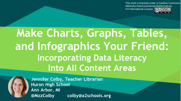
Check out our team member Jen Colby’s presentation on data literacy at the MACUL conference this week! She got 60+ converts from this presentation … will you be next?
Speaking of conferences … save the date for the 2nd 4T Data Literacy Conference, coming July 20-21, 2017. Registration opens in a few weeks! Can’t wait? Our parent conference, the 4T Virtual Conference on impactful technology integration, is May 20-22, 2017. Register here!
2017 Conference dates chosen!
We’re excited to announce that the 2017 4T Data Literacy Virtual Conference dates have been announced! We’ll meet virtually on July 20-21, 2017. This year, we’re focusing our presentations on three (and a half) themes:
- Big Data, including citizen science
- Ethical data use
- Personal data management
Registration and more details will be forthcoming soon. If you registered last year, you’re already on our list and will let you know when it’s time to sign up!

Quotable | 9 Ways to Spot Bogus Data
We’re hard at work editing chapters for our Year 1 data literacy book. While we’re rolling around ideas, here are some ideas from Geoffrey James’ “9 Ways to Spot Bogus Data” in Inc., subtitled “Decision-making is hard enough without basing it on data that’s just plain bad.”
If you don’t know what some of these questions are asking, stay tuned … we’ve got you covered. Soon, anyway.
Good decisions should be “data-driven,” but that’s impossible when that data isn’t valid. I’ve worked around market research and survey data for most of my career and, based on my experience, I’ve come up with touchstones to tell whether a set of business data is worth using as input to decision-making.
To cull out bogus (and therefore) useless data from valid (and therefore potentially useful) data, ask the following nine questions. If the answer to any question is “yes” then the data is bogus:
- Will the source of the data make money on it?
- Is the raw data unavailable?
- Does it warp normal definitions?
- Were respondents not selected at random?
- Did the survey use leading questions?
- Do the results calculate an average?
- Were respondents self-selected?
- Does it assume causality?
- Does it lack independent confirmation?
Let us know which of these you’d like to see unpacked in a future blog post!
Kristin
Team Member Tasha Bergson-Michelson Featured in School Library Journal
We’re delighted that our teammate Tasha Bergson-Michelson was featured in Adrienne Matteson’s School Library Journal article, “Teaching News Literacy? Check Your Own Bias, Says Librarian.” Some excerpts from the article:
If you are like me, the alarm about “fake news” reached a fever pitch in your librarian circles weeks ago … But what about the students who distrust the “mainstream media” and feel their views are more represented in sources you consider untrustworthy? How do we teach the skeptics to be critical thinkers and fact checkers, without alienating them by discounting their beliefs? …
Tasha Bergson-Michelson, a librarian at the Castilleja School in Palo Alto, CA, has been digging into the question of how to teach young people to interrogate what they read, hear, and see. She doesn’t want her students to trust a source unless they have good reason to. Her 10th graders work through a unit on source evaluation that involves them coming up with a shared rubric for the standards by which they will judge whether a source is trustworthy or not. Her students use the standards they’ve identified to argue the validity of the sources they choose moving forward in the project. Bergson-Michelson wants her students to understand that all news sources have a perspective, but they can look through that perspective to assess whether or not the information provided is fact-based and trustworthy …
The best way to begin that cultural change is to face our own biases. Last spring, while Bergson-Michelson set out to teach her students about evaluating the news, she realized that she relied on the same handful of news sources, all of which leaned in one political direction. She sought credible sources from the other side of the aisle …
Her advice for reaching students who think differently than you: practice what you preach …
You can read the complete article here.
(By the way, author Addie Matteson is an alum of the U-M School of Information. Go Blue!)
Data of the Day (Data Visualization): Are you a #HamilFan?
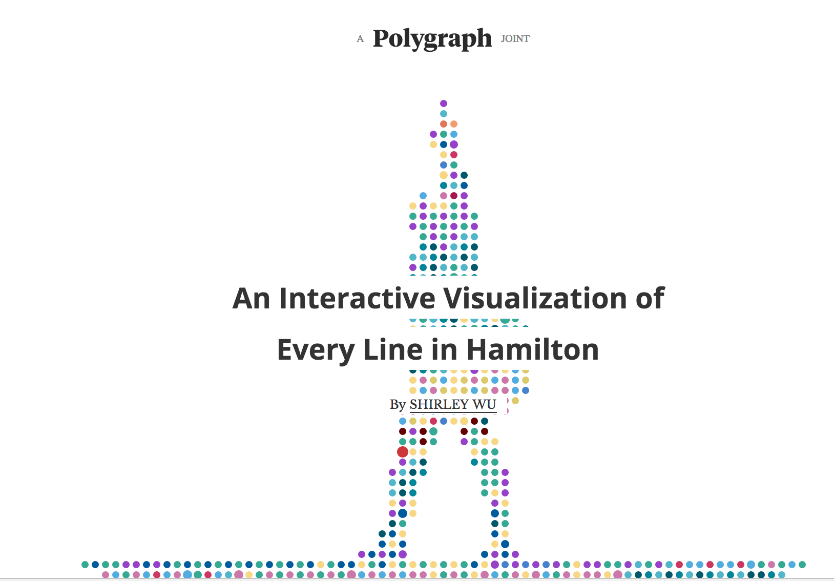
Check out Shirley Wu’s visualization of each line of lyric from the Broadway hit Hamilton (requires a lot of scrolling down).
Here are some possible discussion questions for your students:
- How does this visualization help you gain insight into Hamilton? What, if anything, gets in the way of gaining insight?
- How do colors help you understand Hamilton? How do they get in the way?
- What kinds of analysis are possible with this tool?
- One of the challenges of visualized data is that, unlike spreadsheet data, it cannot be automatically read aloud for those with visual impairments. How would you explain the tool to someone who cannot see the data? What would you add to the tool to make it more accessible for those with visual impairments?
- Overall, how do you rate the effectiveness of this visualization? Support your argument with examples from the visualization.
Hope this makes for a conversation that is nonnnnn-stop!
Quotable | Forbes: Data and “Truth”
From Kalev Leetaru’s “Why Stopping ‘Fake News’ is So Hard” in Forbes:
Data is not the same as “truth” and no matter how large a mountain of evidence you have, the same numbers can be used to support many different conclusions. Into this world, perhaps the best approach might be to recognize that instead of “fake” and “true” news we have a hundred shades of gray in between.
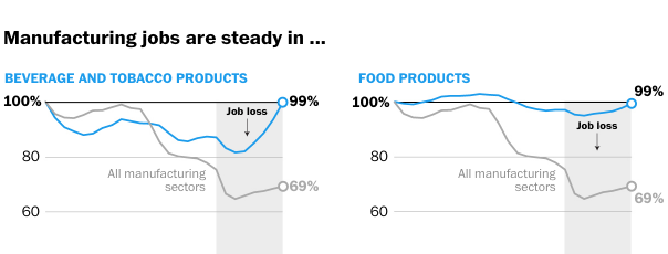
Washington Post: Fascinating Visualizations and Graphs About Manufacturing
The Washington Post has a fascinating series of maps and graphs about the state of manufacturing in the United States.
Here’s a snippet of one of them:
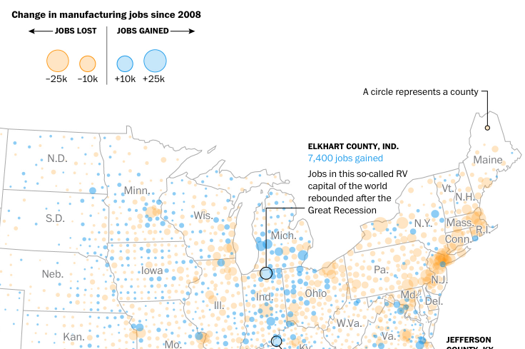
I love newspaper stories like this because you get a wide variety of maps, graphs, and other visualizations that students can use as jumping-off points for discussion and future inquiry.
Click through to take a look at the story, then come back here and think about these questions:
- Based on the data shown above, where might a manufacturing worker want to live to have a better chance at job openings?
- We keep hearing that the Rust Belt states are in terrible economic shape. Does the data above support that claim? What about other data visualizations in the article?
- In the story, compare the various market segment graphs. If you were a high school career counselor and were meeting with a student interested in manufacturing, which market sectors would you encourage her to pursue? Avoid?
- Which states would mostly likely respond better to a political candidate who promises to bring back manufacturing jobs? How does that compare to the election results of 2016?
- What does the sparsity of dots in the manufacturing maps in the West tell us about manufacturing there? What should we be careful not to assume based on those dots?
What else would you discuss with students?
Kristin