Category Archives: Data of the Day

Data of the Day (Data Visualization): Are you a #HamilFan?

Decorative: image of Polygraph's landing page for "An Interactive Visualization of Every Line in Hamilton"

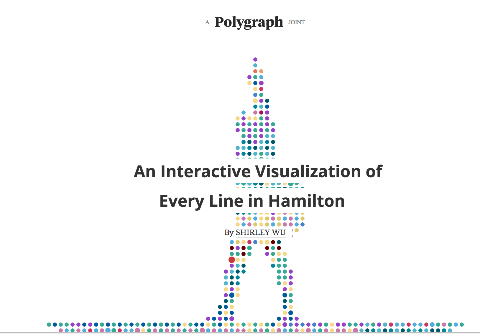
Check out Shirley Wu’s visualization of each line of lyric from the Broadway hit Hamilton (requires a lot of scrolling down).

Here are some possible discussion questions for your students:

  1. How does this visualization help you gain insight into Hamilton? What, if anything, gets in the way of gaining insight?
  2. How do colors help you understand Hamilton? How do they get in the way?
  3. What kinds of analysis are possible with this tool?
  4. One of the challenges of visualized data is that, unlike spreadsheet data, it cannot be automatically read aloud for those with visual impairments. How would you explain the tool to someone who cannot see the data? What would you add to the tool to make it more accessible for those with visual impairments?
  5. Overall, how do you rate the effectiveness of this visualization? Support your argument with examples from the visualization.

Hope this makes for a conversation that is nonnnnn-stop!

Data for Discussion: Ranking Colleges

Screenshot of Money magazine's Best Colleges 2016 list
Screenshot from Money magazine website: http://time.com/money/4393604/how-money-ranks-best-colleges-2016/

College rankings influence how thousands of families of college-aged students make their decisions about applications, how alums decide whether their alma mater “deserves” their donations, and how academics perceive themselves. Money magazine has released annual rankings, along with accompanying methodology.

This is a great dataset to unpack with students. Do the methodology and selection criteria match what they think are valid criteria? Does their sense of “best” match up?

Of course, it goes without saying that it is 100% accurate and true that the University of Michigan should be ranked above Harvard and Stanford. I mean, who hosts this blog, anyway? 🙂

Data for Discussion: Colleges, Universities, and Diversity

Team member Connie Williams sent a link to to the data graphs below, showing lists of various colleges and universities and their diversity levels.

Shown below is the discussion of the data created by the vendor who created the graphs; here is the data as displayed by the customer, BestColleges.com).

What do you see in this data and accompanying text? What questions do you have? How would you engage students in “interrogating the data,” as team member Jole Seroff mentioned in her webinar last week?

Data of the Day: Example Infographics from Statista

10012162166_bdba011392_h

If you would like to find example infographics, Statista — even the open, non-licensed-version of Statista — has many here.   There’s lots to talk about with these images!  And, who knows??!!  Your students may even want to use the data on these pages for their research projects.

As an example, see The Unrelenting March of Diabetes below.  I was surprised to see Russia included in the European Region.   Note also the interesting use of color and size in the chart below.    Think of the size of the circles in relation to the geographic area they represent.   Now look at the percentage in the circles.   You can barely see the map of the Eastern Mediterranean Region underneath a 13.7% circle.  The percentage listed does not really match how much space it takes up on the maps of the different regions — but we would expect that there would be some sort of relationship there.  The relational size is actually in “mapping” the red circles and orange circles to each other.  If they had made the circles any smaller in order to show the geographic relationships, we probably couldn’t read what was in the circles!

Infographic: The Unrelenting Global March Of Diabetes | Statista
You will find more statistics at Statista

And, please know, there are a lot of amazing infographics at Statista — Some really good ones!  Check it out!

Image:  “World Map: Abstract Acrylic” by Nicholas Raymond on Flickr http://flic.kr/p/gfJWZC and http://freestock.ca/ CC BY 2.0


Data of the Day: the power of small multiples (NYTimes)

Small multiples is a data visualization term referring to placing several small graphics (either all charts, all graphs, all maps, etc.), where the scale (axes, etc.) are the same but the data is different. Here’s a great example from the New York Times.
The presence of small multiples means we can track drought patterns over decades within a very small space, as shown in the clip below.
This can be a great accompaniment to a high school study of the Dust Bowl, for example.

h/t Justin Joque, University of Michigan Library

Data of the Day: Campaign Finance Visualization from LA Times

U-M data visualization librarian Justin Joque pointed our team to the Los Angeles Times‘ series of visual data on fundraising for the 2016 presidential election.

Here are some things we talked about when we discussed this in our face-to-face workshop that could form a discussion in your classroom in a Data of the Day exercise.

Here’s a partial view of the first graphic, followed by discussions we had about it.

  • Sometimes, there are graphics that look like they are lacking details or information, but the information is found elsewhere on the page. That is the case here. Rule of thumb: don’t decontextualize (or try to recontexualize) a graphic from text it was designed to accompany.
  • We wondered about how pink and green would look to those who were color-blind or printing this out in black-and-white. If you are making a visualization and need colorblind-safe or printer-friendly colors? Try Color Brewer 2 as a tool.

We then scrolled down to the maps showing amount raised by candidate (sorry – couldn’t grab a Kwout), a technique known as small multiples, which shows you many small graphics that you can compare with

  • Lots of money comes from the big states. Does this mean that more money becomes from big states because they are have the most people (and, by logical probability) the most donors? Or is there some other reason? What do these maps really tell you with confidence?
  • Be sure to scroll down to the less popular candidates. How does the visualized data of Chaffee or Pataki illuminate in ways different from that for Clinton, for example?
  • It’s hard to tell the difference between lighter and darker hues of greens, making comparisons between middle states hard to do.
  • You can mouse over the states for more data (but not on mobile). Nothing signals to the reader that you can mouse over data.

And in general, we talked about …

  • Where does your eye go first? Number? Image? How does that change

Data of the Day: “Who’s Paying for the President?”

Our data visualization expert Justin Joque pointed us to this infographic, which we discussed over our face-to-face meeting. We thought you’d enjoy hearing our conversation and considering this as an example for your students’ discussion.

If you were sharing this with a class, you might open up the conversation with an open question like, “What do you see/notice?

As your students respond, here are some aspects you could consider unpacking with your students to not only have an interesting conversation but also connect them to some of the important and critical thinking questions behind visualizations.

  • What is the “story” of this infographic? Is it clearly told? How? What are the elements that you see that tell this story?
  • Romney and Obama have very different-looking heads. How does the size clarify or obfuscate?
  • Is there an unstated point of view? What is it? How do you know? How does this point of view influence how you see the information?
  • Notice the artistic choices the creator makes (e.g., 7.6% is a different font size from 25.5%). How do these choices change the way you understand the data?
  • Do the colors imply that some funds are “good” sources and some “bad”? What do you make of this?
  • How (or in what order) did you read this? Left to right? Up and down? Inside/outside? How did this change the way you took in and comprehended the information?
  • By using the heads as the “container” for the visualized content, it means that the 7.6% and 25.5% are not proportional. Is this useful? What implicit message might this visual choice be giving, apart from the data itself?
  • What is the message the creator wants you to get? How do design elements emphasize or detract from that message?
  • How might visualizing this differently (e.g., a pie chart or bar graph) communicate this data differently? How would different visualizations influence the way the message was delivered to viewers or readers?
  • Are the artists who create visualizations responsible for showing only the data, or is some artistic license to add impact OK or even desirable?
  • What did you learn after a few minutes of discussing this infographic that you didn’t notice at first? In other words, how did time help you incubate, refine, or augment your understanding?
  • What role might confirmation bias play in this graphic? Is it geared toward Obama voters?
  • What can you elicit from a critical reading of the text surrounding the visual?