Category Archives: Data Presentation

Data for Discussion: Colleges, Universities, and Diversity

Team member Connie Williams sent a link to to the data graphs below, showing lists of various colleges and universities and their diversity levels.

Shown below is the discussion of the data created by the vendor who created the graphs; here is the data as displayed by the customer, BestColleges.com).

What do you see in this data and accompanying text? What questions do you have? How would you engage students in “interrogating the data,” as team member Jole Seroff mentioned in her webinar last week?

Data design inspiration

Having some quick, go-to strategies that students can adopt to structure their visualized data into infographics and other forms can really raise the intentionality and outcome of student work. We recommend this video that introduces graphic designer Richard Saul Wurman’s five methods of organizing information visually. It can help inspire and focus students when they are stumped about how to design visualizations — take a look!

Decorative Image: “FTSE 100 modified” by Phil Gyford on Flickr. CC-BY-NC-ND-2.0.

Webinar on Data Presentation

Do you ever wonder when to use a line graph, bar chart, or pie chart? Or how your data might look different depending on which kind of tool you use? Then you might be interested in data presentation, the process of deciding which tool to use and what elements to employ.

We are delighted to share the webinar below, hosted by Tierney Steelberg, with you. She’ll lead you through the kinds of questions you can ask yourself so you and your students can make charts, graphs, and tables that communicate more clearly and completely.

Enjoy!

Kristin

Image: “FTSE 100 modified” by Phil Gyford on Flickr. CC-BY-NC-ND-2.0. 

Pie chart from Wikimedia Common

Data of the Day: Pie Slices!

Often, when students make pie charts, they end up with several very narrow slices. One thing we can encourage our students to do is think about what happens to their readers’ comprehension when the slices get so narrow that they’re almost impossible see.

Here’s a rule of thumb to consider:

Image that reads, "Rule of Thumb: Too many categories on a pie chart can actually reduce comprehension."

Visualization: The Stacked Area Chart

There are so many kinds of visualizations! Among them are stacked area charts — ever looked at or made one? Aside from their colorful visual appeal, they show information about items or topics in a category over time. They can be interactive or static.

One example of this type of chart is about causes of death. This visualization by Nathan Yau (of the website Flowing Data) reveals the prevalence of various reasons for death. It is organized by gender or race. Because it is interactive, the viewer can isolate a particular gender, race, or cause of death.

So what can you learn from this kind of visualization?

  • It gives a broad view of a topic. It can answer a question like, what are common causes of death for women? It cannot answer a question like, how many people die from external causes each year? (Some stacked area charts do give counts, though.)
  • It is ideal for making general comparisons. In addition to viewing percentage differences between the causes, you can see general patterns and trends, such as, how do men and women compare?
  • It can inspire more research. When you notice a trend, such as “external causes” as more prevalent at younger ages, it raises questions. What do “external causes” include? Why might that be a more common cause for young people? Go to the original data, as well as other sources of the same information, for more background and potential answers.

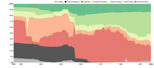
Other examples of this type of chart include one about political systems (pictured above) and what fills people’s time.

What stacked area charts have you encountered? Do you have a different “favorite” visualization?

Image: “The Shares of World Citizens living under different political systems – Max Roser” by Max Roser on Our World in Data. CC By-SA. http://ourworldindata.org/data/political-regimes/democratisation/