Category Archives: Statistical Literacy

Data Literacy at MACUL!

Screenshot of slide deck

Check out our team member Jen Colby’s presentation on data literacy at the MACUL conference this week! She got 60+ converts from this presentation … will you be next?


Speaking of conferences … save the date for the 2nd 4T Data Literacy Conference, coming July 20-21, 2017. Registration opens in a few weeks! Can’t wait? Our parent conference, the 4T Virtual Conference on impactful technology integration, is May 20-22, 2017. Register here!

Image of data dashboard. Photo public domain via PIxabay.com

Quotable | 9 Ways to Spot Bogus Data

We’re hard at work editing chapters for our Year 1 data literacy book. While we’re rolling around ideas, here are some ideas from Geoffrey James’ “9 Ways to Spot Bogus Data” in Inc., subtitled “Decision-making is hard enough without basing it on data that’s just plain bad.”

If you don’t know what some of these questions are asking, stay tuned … we’ve got you covered. Soon, anyway.

Good decisions should be “data-driven,” but that’s impossible when that data isn’t valid. I’ve worked around market research and survey data for most of my career and, based on my experience, I’ve come up with touchstones to tell whether a set of business data is worth using as input to decision-making.

To cull out bogus (and therefore) useless data from valid (and therefore potentially useful) data, ask the following nine questions. If the answer to any question is “yes” then the data is bogus:

  1. Will the source of the data make money on it?
  2. Is the raw data unavailable?
  3. Does it warp normal definitions?
  4. Were respondents not selected at random?
  5. Did the survey use leading questions?
  6. Do the results calculate an average?
  7. Were respondents self-selected?
  8. Does it assume causality?
  9. Does it lack independent confirmation?

Let us know which of these you’d like to see unpacked in a future blog post!

Kristin


Using samples in citizen science

Interested in embarking on a citizen science project? One way to learn about the world around you is to take a sample. In fact, this spring the radio and podcast program, Science Friday, encouraged listeners to take samples, which sparked a variety of ideas from listeners.

So how do you go about getting a sample? As Charles Wheelan writes in Naked Statistics, it’s like soup! In all seriousness, best practice is to take a representative sample.  Wheelan explains that:

[t]he key idea is that a properly drawn sample will look like the population from which it is drawn. In terms of intuition, you can envision sampling a pot of soup with a single spoonful. If you’ve stirred the soup adequately, a single spoonful can tell you how the whole pot tastes.

This soup analogy is informative. If a sample is not representative (or the soup is not well-stirred), we cannot make generalizations. Wheelan explains:

[s]ize matters, and bigger is better…it should be intuitive that a larger sample will help smooth away any freak variation. (A bowl of soup will be an even better test than a spoonful.) One crucial caveat is that a bigger sample will not make up for errors in its composition, or “bias.” A bad sample is a bad sample.

From a sample, we may learn something about a population, but we must take care not to overgeneralize. For more on samples and other statistical concepts, Naked Statistics is a useful primer and one of the books that our team has enjoyed.


Source: Wheelan, Charles. Naked Statistics: Stripping the Dread from the Data. New York: W.W. Norton, 2014.

Image: “Pot Steaming Hot Cooking Kitchen Stove Cooker” by Republica, on Pixabay. CC0 Public Domain.

Reading Recommendation: Stat-Spotting

In the first year of this project, we have focused on the themes of statistical literacy, data as argument, and data visualization. One book that supported our understanding of statistics and data in the wild is Stat-Spotting: A Field Guide to Identifying Dubious Data by Joel Best.

Statistics are formed from data. As Best writes, “[e]very statistic is the result of specific measurement choices.” Keeping this idea in mind is important when interpreting statistics that you encounter. Statistics are representations of data. They have been created to summarize data.

Best’s advice is easy to put into practice whenever you see a statistic. He writes:

…it is always a good idea to pause for a second and ask yourself: How could they know that? How could they measure that? Such questions are particularly important when the statistic claims to measure activities that people might prefer to keep secret. How can we tally, say, the number of illegal immigrants, or money spent on illicit drugs? Oftentimes, even a moment’s thought can reveal that an apparently solid statistic must rest on some pretty squishy measurement decisions.

Asking those questions is one way to be a more critical consumer of statistics. Try it!


Source: Best, Joel. Stat-Spotting: A Field Guide to Identifying Dubious Data, 2nd ed. Berkeley, CA: University of California Press, 2013.

Image: “Percent Characters Null Rate Symbol Percentage” by geralt, on Pixabay. CC0 Public Domain.

Reading recommendation: Everydata

Looking for something to read? Are you seeking to brush up on data literacy basics?

Everydata: The Misinformation Hidden in the Little Data You Consume Everyday by John H. Johnson and Mike Gluck is a nice introduction to developing critical thinking skills for data. It is full of bite-sized examples from everyday life, as Fast Company‘s review points out. At the end of each chapter, there is a handful of tips on how to apply the topics in the chapter.

For example, Johnson and Gluck shed light on self-reported data:

How many times did you eat junk food last week?

How much TV did you watch last month?

How fast were you really driving?

When you ask people for information about themselves, you run the risk of getting flawed data. People aren’t always honest. We have all sorts of biases. Our memories are far from perfect. With self-reported data, you’re assuming that “8” on a scale of 1 to 10 is the same for all people (it’s not). And you’re counting on people to have an objective understanding of their behavior (they don’t). (p. 20-1)

Johnson and Gluck acknowledge that “[s]elf-reported data isn’t always bad…. It’s just one more thing to watch out for, if you’re going to be a smart consumer of data.” This salient point is easy to keep in mind when looking at sources with students, reading the newspaper, browsing the web, listening to the radio on the way home from work, etc.

Everydata isn’t about the math; it’s about understanding the data and numbers that you encounter. Take a look at it for more practical tips like that one!


Source: Johnson, John H., and Mike Gluck. Everydata: The Misinformation Hidden in the Little Data You Consume Every DayBrookline, MA: Bibliomotion, 2016.

Image: “Photo 45717” by Dom J, on Pexels. CC0 License.

Adventures with Correlation and Causation

One of the first things that I learned for this project was that correlation does not imply causation. While it is easy to be critical of misrepresentations of causation, it is much trickier to apply the concept myself! This week, I was composing a research proposal and struggling to design my experiment so that it tests causation. My first iterations would have only revealed correlations. After working with a research professor to redesign my proposed experiment, I added a qualitative test to determine the effect of the independent variable on the dependent variable. This change would hopefully show causation if it existed. My experience taught me what a slippery concept causation is!

To improve my understanding, I revisited one of the books that our whole team read to grow in our data literacy. Naked Statistics by Charles Wheelan covers basic statistics with real-world examples. Wheelan offers a clear explanation of the difference between correlation and causation:

…a positive or negative association between two variables does not necessarily mean that a change in one of the variables is causing a change in the other. For example, I alluded earlier to a likely positive correlation between a student’s SAT scores and the number of televisions that his family owns. This does not mean that overeager parents can boost their children’s test scores by buying an extra five televisions for the house. Nor does it likely mean that watching lots of television is good for academic achievement.

The most logical explanation for such a correlation would be that highly educated parents can afford a lot of televisions and tend to have children who test better than average. Both the televisions and the test scores are likely caused by a third variable, which is parental education. I can’t prove the correlation between TVs in the home and SAT scores. (The College Board does not provide such data.) However, I can prove that students in wealthy families have higher mean SAT scores than students in less wealthy families. (p. 63)

This illuminating passage helped me grasp the distinction between correlation and causation. Televisions do not cause higher test scores but are correlated with them. Digging deeper reveals other variables — parental education and family wealth — that do affect test scores.

From learning how to apply these concepts and going back to a resource, I now have a much deeper understanding of correlation and causation!

Source: Wheelan, Charles. 2014. Naked Statistics: Stripping the Dread from the Data. New York: W.W. Norton.

Image: “Family watching television 1958” by Evert F. Baumgardner on Wikimedia Commons. Public Domain.

Data and the Flint Water Crisis

What's behind Flint Water Crisis?

This week I worked with U-M Library’s Emergent Research Committee to bring Marty Kaufman to the library.  He talked about the data gathering that he’s been doing to help map the locations of lead pipes in Flint’s water system.  For more on his talk see Patricia Anderson’s great Storified version  or the MLive coverage of his presentation.

Whenever I mention the Flint Water Crisis to students they become really engaged.  My colleagues and I are using the information about this issue to discuss things like the nature of authority in informational sources (“Authority is Constructed and Contextual” for my academic librarian peeps), and students seem to really catch on.  I talked with my advanced research students yesterday about the crisis, and I didn’t have to remind them in any way about what’s going on.  And just the other day, my 24 year old nephew mentioned that he had stayed up until midnight to watch the Flint Water Crisis Congressional hearings.  He says that sometimes watching election coverage seems like he’s watching some kind of movie.  But what’s happening in Flint seems “real.”

Granted, what’s happening in Flint seems very local in my community.  And the governor lives in Ann Arbor when he’s not in Lansing.  I don’t want to seem like I’m looking at what’s happening in just a clinical, removed kind of way.   This issue resonates with so many people.  And there’s a very data-related component to what’s happening.

In his presentation, Marty talked about how he and his team had to go through thousands of penciled index cards (“big” data) to determine where lead pipes are located.  He said that it’s difficult to get a clear sense of where things are because of unclear index cards (data) — yet they have to draw some kinds of conclusions.  Based on the data that they’ve gathered, the team is going to have to use predictive models to determine the likelihood of where lead pipes might be in places without clear index cards.

When asked what the general public should do, Marty made a clear case for all of us to become data collectors — He told us to look for lead in the water systems, paint, and toys within our own homes (a place where lead might be impacting all of us the most!) and record it accurately and PERMANENTLY (don’t use pencil!).  Somehow, if we can all gather this kind of data and pool our information, we can better address the serious issue of how lead exposure can impact our lives.

One of the most striking images in Marty’s presentation is the image of  undergraduates working in his GIS lab, many of them Flint-area residents.  Marty says that he had to kick the students out at the end of the day because they were so invested in their work.  Understanding that data comes from “somewhere” and that having good data can make a real impact on your life is a huge motivator.   Data and data literacy matter.

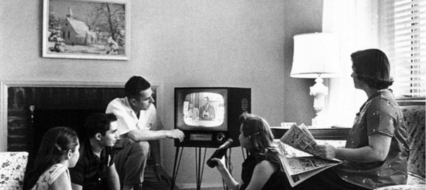
Photo: Ben Gordon, CCBY-NC-SA 2.0

Holistically Integrating “Real Math” into the Curriculum

Calculus Image

“Andrew Hacker, a professor of both mathematics and political science at Queens University has a new book out, The Math Myth: And Other STEM Delusions, which makes the case that the inclusion of algebra and calculus in high school curriculum discourages students from learning mathematics, and displaces much more practical mathematical instruction about statistical and risk literacy, which he calls “Statistics for Citizenship.””

Andrew Hacker has an intriguing idea that the high school math curriculum needs to be radically re-examined.   And, no … He’s not talking about Common Core!  What if we didn’t teach Algebra II and Calculus in high school and instead taught, “Statistics for Citizenship?”  Would there be less math anxiety for students?  Would lessening the requirements for some professional training , like EMT training, open professional doors and expand the workforce?  Would students be more statistically literate and better citizens?  Would we finally be able to answer the age-old, high school question, “When am I going to use calculus in real life?”  (And just to be clear … I LOVED math in high school and took every math class that I could!).

Hacker is advocating that teaching statistical literacy explicitly in a classroom devoted to these concepts is better than dedicating part of the day to teaching advanced math.  Statistical literacy is one of the main concepts of the grant this year.  Overall, I’ve really struggled with looking at how teaching data literacy can be holistically integrated into the curriculum.  I want our work to be useful and successful so implementing it is always on my mind

School librarians present an interesting model for holistic integration of any curricular change.  While some teachers think that librarians are only working with English or Social Studies teachers, school librarians can work with any teacher — Some work with Health teachers as students create posters representing good health practices.  Others work with science fair participants to create solid ideas around the practical application of scientific concepts.  The list goes on and on.  As one of our Library Development Officers used to say to potential donors, “The Library is for Everybody.”  Having a separate statistical literacy class flies in the face of having students see how any information literacy concept is integral to the rest of their work as they encounter the practical application of these ideas throughout their day.

Dedicating part of the day to statistical literacy is intriguing to me.  Having a class like this occupy some of the day’s “real estate” would send a signal that statistics for citizenship is important for our children … Yet … I always wonder about the holistic aspect of separating out overriding conceptual ideas into their own place in the curriculum.  I struggle with this separation in teaching information literacy too — Why can’t info lit be more grounded into the rest of the curriculum, especially at the college level?  I’m not sure that I know the answers to these questions.  Maybe we could find a thematic approach — Students could have a separate class AND apply statistical literacy ideas in science, English, government, and other classes.  Is that asking too much?

Image:  “Calculus” by fitriahandayani on Flickr. CC-BY-2.0. https://flic.kr/p/9yZ1rp

London by night seen from the International Space Station.

Video: Interested in Getting Your Feet Wet With Statistics?

We’re delighted to have Lynette Hoelter of the Interuniversity Consortium for Political and Social Research (ICPSR), housed in the University of Michigan’s Institute for Social Research, on board in our project as one of our data experts. In addition to her role at ICPSR, she teaches Introduction to Statistics at Eastern Michigan University, so she understands data in multiple ways and at multiple levels.

We used this 2014 webinar of hers, “Data, Data Everywhere and Not a Number to Teach!” as a pre-“read” prior to our meeting of the minds of grant personnel. We chose this video of hers because she understands how data literacy can be valuable not just in statistics class but across disciplines and in the real world.

We hope you’ll enjoy it, too!

Kristin Fontichiaro

Image: “London by Night seen from the International Space Station” by NASA on Wikipedia. Public domain.