Category Archives: Videos/Webinars

Decorative - 4T Data Literacy conference logo

This Week! 4T Virtual Conference on Data Literacy

The first 4T Virtual Conference on Data Literacy is this week Thursday, July 14, and Friday, July 15. Join us to learn about building the data and statistical literacy of high school students. Attendance is free, and all are welcome!

Please complete the registration to attend or receive information about archived sessions.

See the Frequently Asked Questions for more information about attending.

We are looking forward to seeing you in our online sessions soon!
Data design inspiration

Having some quick, go-to strategies that students can adopt to structure their visualized data into infographics and other forms can really raise the intentionality and outcome of student work. We recommend this video that introduces graphic designer Richard Saul Wurman’s five methods of organizing information visually. It can help inspire and focus students when they are stumped about how to design visualizations — take a look!

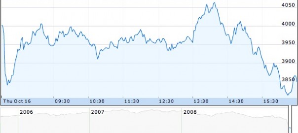
Decorative Image: “FTSE 100 modified” by Phil Gyford on Flickr. CC-BY-NC-ND-2.0.

Webinar on Data Presentation

Do you ever wonder when to use a line graph, bar chart, or pie chart? Or how your data might look different depending on which kind of tool you use? Then you might be interested in data presentation, the process of deciding which tool to use and what elements to employ.

We are delighted to share the webinar below, hosted by Tierney Steelberg, with you. She’ll lead you through the kinds of questions you can ask yourself so you and your students can make charts, graphs, and tables that communicate more clearly and completely.

Enjoy!

Kristin

Image: “FTSE 100 modified” by Phil Gyford on Flickr. CC-BY-NC-ND-2.0.