Category Archives: Data in Arguments

Data Literacy at MACUL!

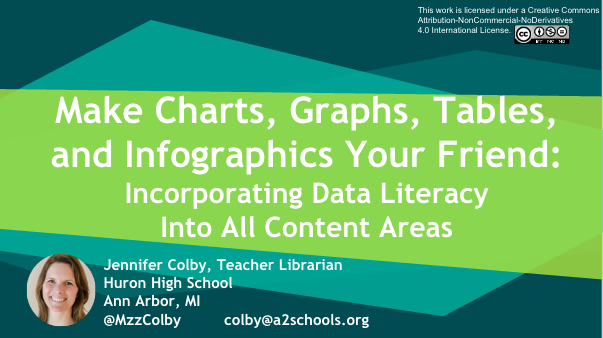
Screenshot of slide deck

Check out our team member Jen Colby’s presentation on data literacy at the MACUL conference this week! She got 60+ converts from this presentation … will you be next?


Speaking of conferences … save the date for the 2nd 4T Data Literacy Conference, coming July 20-21, 2017. Registration opens in a few weeks! Can’t wait? Our parent conference, the 4T Virtual Conference on impactful technology integration, is May 20-22, 2017. Register here!

Image of data dashboard. Photo public domain via PIxabay.com

Quotable | 9 Ways to Spot Bogus Data

We’re hard at work editing chapters for our Year 1 data literacy book. While we’re rolling around ideas, here are some ideas from Geoffrey James’ “9 Ways to Spot Bogus Data” in Inc., subtitled “Decision-making is hard enough without basing it on data that’s just plain bad.”

If you don’t know what some of these questions are asking, stay tuned … we’ve got you covered. Soon, anyway.

Good decisions should be “data-driven,” but that’s impossible when that data isn’t valid. I’ve worked around market research and survey data for most of my career and, based on my experience, I’ve come up with touchstones to tell whether a set of business data is worth using as input to decision-making.

To cull out bogus (and therefore) useless data from valid (and therefore potentially useful) data, ask the following nine questions. If the answer to any question is “yes” then the data is bogus:

  1. Will the source of the data make money on it?
  2. Is the raw data unavailable?
  3. Does it warp normal definitions?
  4. Were respondents not selected at random?
  5. Did the survey use leading questions?
  6. Do the results calculate an average?
  7. Were respondents self-selected?
  8. Does it assume causality?
  9. Does it lack independent confirmation?

Let us know which of these you’d like to see unpacked in a future blog post!

Kristin


“Guesstimations”

Numerical estimates, such as ballpark figures or “guesstimations,” abound in school, work, and our lives. For example, you can roughly calculate the impact of shopping with a reusable grocery bag, instead of using plastic bags, for a year. But how can anyone know that? How do we make sense of “guesstimations?” Are they even grounded in good mathematical principles?

Our team member Connie Williams shared a video of a talk by Dr. Lawrence Weinstein, a professor at Old Dominion University. In his lecture, “Guesstimating the Environment,” he points out that “guesstimations” are inherently imprecise. He covers the use of “guesstimations” in topics ranging from ethanol to windmills and considers issues by calculating estimates. While “guesstimations” are imprecise, they do provide a way to understand the scope of a problem.

Watching this lecture, or a portion of it, could spark a discussion about “guesstimations” in the news and academic resources with your students. Some questions to discuss include:

  • Where do “guesstimations” appear?
  • What purposes do “guesstimations” serve?
  • What are the limitations of “guesstimations?”
  • What are appropriate uses and applications of “guesstimations?”


Dr. Weinstein also asks a key question about a “guesstimation:”

Is this a lot or a little?

It can be hard to know if a “guesstimations” is big or small. Consequently, Dr. Weinstein emphasizes the need to compare the numbers to something else. A comparison is a great way to make sense of numbers, whether they are estimates, actual counts, probabilities, or statistics. When creating or evaluating “guesstimations,” a helpful rule of thumb is to find something with which to compare it or help to put it in context. In the grocery bag example, he explains how to compare a person’s annual use of plastic bags to gasoline burned by driving her car. It turns out that the amount of plastic bags that an individual uses is insignificant compared to how much gas that her car burns. The lecture contains many more examples like this — have a look!


Image: “Bags Plastic Shopping Household Colorful Sunny” by BRRT, on Pixabay. CC0 Public Domain.

Reading Recommendation: Stat-Spotting

In the first year of this project, we have focused on the themes of statistical literacy, data as argument, and data visualization. One book that supported our understanding of statistics and data in the wild is Stat-Spotting: A Field Guide to Identifying Dubious Data by Joel Best.

Statistics are formed from data. As Best writes, “[e]very statistic is the result of specific measurement choices.” Keeping this idea in mind is important when interpreting statistics that you encounter. Statistics are representations of data. They have been created to summarize data.

Best’s advice is easy to put into practice whenever you see a statistic. He writes:

…it is always a good idea to pause for a second and ask yourself: How could they know that? How could they measure that? Such questions are particularly important when the statistic claims to measure activities that people might prefer to keep secret. How can we tally, say, the number of illegal immigrants, or money spent on illicit drugs? Oftentimes, even a moment’s thought can reveal that an apparently solid statistic must rest on some pretty squishy measurement decisions.

Asking those questions is one way to be a more critical consumer of statistics. Try it!


Source: Best, Joel. Stat-Spotting: A Field Guide to Identifying Dubious Data, 2nd ed. Berkeley, CA: University of California Press, 2013.

Image: “Percent Characters Null Rate Symbol Percentage” by geralt, on Pixabay. CC0 Public Domain.

A 4T Data Literacy Attendee on the 4TDL Conference

Oakland County educator (and U-M grad!) Jianna Taylor wrote on the Oakland Schools Literacy blog about her attendance at the 4T Data Literacy conference. She said, in part:

I attended multiple sessions, on topics ranging from an introduction to data literacy, to data literacy in the content areas, to action research in the classroom. For this conference, I was most looking forward to the sessions about data visualization and infographics, though. I’ve dabbled with making infographics and have always wanted to have students create them, but I was never sure how to go about doing that, because I didn’t feel that I had a design background.

As the presenters were speaking, something that one of them said really struck me: think of an infographic like an argumentative essay.  The infographic itself is the overall argument. The images, design, and information are the evidence and reasons.

Thinking about infographics in this way was like a light bulb going off in my head. Writing arguments with supporting evidence is something students are well versed in, and moving from a traditional essay to a different argumentative form seemed like a great next step.

Thanks for the feedback, Jianna! You can read more of her reflection here.

Reading recommendation: Everydata

Looking for something to read? Are you seeking to brush up on data literacy basics?

Everydata: The Misinformation Hidden in the Little Data You Consume Everyday by John H. Johnson and Mike Gluck is a nice introduction to developing critical thinking skills for data. It is full of bite-sized examples from everyday life, as Fast Company‘s review points out. At the end of each chapter, there is a handful of tips on how to apply the topics in the chapter.

For example, Johnson and Gluck shed light on self-reported data:

How many times did you eat junk food last week?

How much TV did you watch last month?

How fast were you really driving?

When you ask people for information about themselves, you run the risk of getting flawed data. People aren’t always honest. We have all sorts of biases. Our memories are far from perfect. With self-reported data, you’re assuming that “8” on a scale of 1 to 10 is the same for all people (it’s not). And you’re counting on people to have an objective understanding of their behavior (they don’t). (p. 20-1)

Johnson and Gluck acknowledge that “[s]elf-reported data isn’t always bad…. It’s just one more thing to watch out for, if you’re going to be a smart consumer of data.” This salient point is easy to keep in mind when looking at sources with students, reading the newspaper, browsing the web, listening to the radio on the way home from work, etc.

Everydata isn’t about the math; it’s about understanding the data and numbers that you encounter. Take a look at it for more practical tips like that one!


Source: Johnson, John H., and Mike Gluck. Everydata: The Misinformation Hidden in the Little Data You Consume Every DayBrookline, MA: Bibliomotion, 2016.

Image: “Photo 45717” by Dom J, on Pexels. CC0 License.

Recognizing the need for data literacy

Awareness is growing that students need instruction on interacting with data, as our project is helping librarians teach. In the prevalence of data, technology, the Internet, and digital resources, data literacy is a competency that equips students to navigate information. Education Week recently highlighted this need, including the skills to use data as arguments and understand data privacy.

Internet research skills on mobile technology

How do you teach good online research skills to students who use mobile technology?

Librarians are observing that students approach research differently on mobile technology. Infinite scrolling makes re-finding difficult. The abundance of information has led to differing ideas about what sources are credible. Our team member Wendy Stephens wrote about these issues on School Library Journal. Included in her piece are insights from our team member Tasha Bergson-Michelson.

Wendy writes:

Evaluating information is necessarily a more time intensive and complicated process than retrieving information in a networked environment, but teens have demonstrated shifting notions about what makes a source valuable. Pickard, Shenton, and Johnson (2014) found that the young people they surveyed at an English secondary school, when presented with a list of particular evaluative criteria for online research, were not interested in traditional authority of information. Those students instead prioritized currency and topicality, lack of mechanical errors, and verifiability. The last item in particular suggests that young people find recurring information, shared in a variety of places, to be a hallmark of authenticity at odds with earlier notions of authorial attributions.

“Search is a garbage in, garbage out process,” says Tasha Bergson-Michelson, instructional and programming librarian at Castilleja School in Palo Alto, CA. “Choosing search terms is hard. If you have the right words, you can find the data.”

Transferring research standards to current technology is necessary, as Wendy concludes:

The topics may differ and the sources might look different, but online research still points to many of the hallmarks of an established process. Contextualizing the acquisition of search skills, as Martin suggests, and refining search terms as Bergson-Michelson advocates, reiterate principles of bibliographic instruction grounded in print research. But the necessary authenticity of the research task will remain integral, and this is where librarians are key in championing and supporting inquiry projects of students’ own devising, helping young people connect to a range of resources to inform their particular passions.

These points connect to data literacy because knowing how search works is part of responsible digital citizenship and, relatedly, personal data management. Thanks, Wendy and Tasha!

Image: “Apple Iphone Smartphone Technology Mobile Phone,” by Pexels on Pixabay. CC0 Public Domain.

Adventures with Correlation and Causation

One of the first things that I learned for this project was that correlation does not imply causation. While it is easy to be critical of misrepresentations of causation, it is much trickier to apply the concept myself! This week, I was composing a research proposal and struggling to design my experiment so that it tests causation. My first iterations would have only revealed correlations. After working with a research professor to redesign my proposed experiment, I added a qualitative test to determine the effect of the independent variable on the dependent variable. This change would hopefully show causation if it existed. My experience taught me what a slippery concept causation is!

To improve my understanding, I revisited one of the books that our whole team read to grow in our data literacy. Naked Statistics by Charles Wheelan covers basic statistics with real-world examples. Wheelan offers a clear explanation of the difference between correlation and causation:

…a positive or negative association between two variables does not necessarily mean that a change in one of the variables is causing a change in the other. For example, I alluded earlier to a likely positive correlation between a student’s SAT scores and the number of televisions that his family owns. This does not mean that overeager parents can boost their children’s test scores by buying an extra five televisions for the house. Nor does it likely mean that watching lots of television is good for academic achievement.

The most logical explanation for such a correlation would be that highly educated parents can afford a lot of televisions and tend to have children who test better than average. Both the televisions and the test scores are likely caused by a third variable, which is parental education. I can’t prove the correlation between TVs in the home and SAT scores. (The College Board does not provide such data.) However, I can prove that students in wealthy families have higher mean SAT scores than students in less wealthy families. (p. 63)

This illuminating passage helped me grasp the distinction between correlation and causation. Televisions do not cause higher test scores but are correlated with them. Digging deeper reveals other variables — parental education and family wealth — that do affect test scores.

From learning how to apply these concepts and going back to a resource, I now have a much deeper understanding of correlation and causation!

Source: Wheelan, Charles. 2014. Naked Statistics: Stripping the Dread from the Data. New York: W.W. Norton.

Image: “Family watching television 1958” by Evert F. Baumgardner on Wikimedia Commons. Public Domain.

Sampling, Defining Diversity, and Presidential Politics

When we wrote this grant, we expressed a sense of urgency: that, regardless of party affiliation, students needed data literacy skills to better understand the 2016 presidential election. Little did we know that the election would be more chaotic and less predictable than any in our lifetimes!

Case in point, this article from Quartz, which stated:

During the CNN/Telemundo debate on Feb. 25, Florida senator Marco Rubio proclaimed the Republican party “the party of diversity.”

With two Cuban Americans (Rubio and Ted Cruz) and one African American (Ben Carson) on the stage, “We are the party of diversity, not the Democrats,” he declared.

But as Slate’s Jamelle Bouie noted on Twitter, the numbers don’t add up. Roughly only 11% of the GOP is made up of minority voters.

This is a great example of how different sampling can lead to different truths. If you’re looking at the faces on the Republican debate stage, then yes, three of the five (or 60% of the) candidates are from underrepresented minorities. 60% is pretty impressive. But … let’s pull back the camera and expand the sample size. According to the latest Gallup poll, Quartz’s Jake Flanigin reports, 89% of Republicans are “non-Hispanic white.” 60% diverse? Or 89% not? All depends on who is being sampled.

And let’s consider what we mean by “diversity.” If we mean “people from different cultural backgrounds” or “people of different skin colors,” then indeed, the Republican candidates are diverse. But if we expand diversity to include gender diversity, then a field of men (now five, but at one time 16 of 17 Republican candidates) isn’t very diverse at all. If we define “diverse” to include socioeconomic status, then there’s definitely a clustering of folks above the $100K/year family income line.

To be fair, we can tell the Democratic story of diversity in many ways, too.

  • Both candidates — 100% — are white. Even when the field was 6 candidates, it was 100% white. Worse diversity than Republicans!
  • Both (100% of) candidates were born into English-speaking homes as opposed to 60% of Republicans. Less diverse than Republicans!
  • 50% are women. Much better than Republicans!
  • 0% own their own plane. 20% of Republican candidates (meaning: Trump) own their own plane. Republicans are more diverse!

As the primary and caucus season heats up, there will be many more opportunities for students to engage actively in presidential politics and to put their nascent data literacy skills to the test. Sometimes, there can be more than one way to tell the truth.

What do you notice in campaign rhetoric that could be a teachable moment in your school?