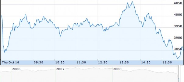
Do you ever wonder when to use a line graph, bar chart, or pie chart? Or how your data might look different depending on which kind of tool you use? Then you might be interested in data presentation, the process of deciding which tool to use and what elements to employ.
We are delighted to share the webinar below, hosted by Tierney Steelberg, with you. She’ll lead you through the kinds of questions you can ask yourself so you and your students can make charts, graphs, and tables that communicate more clearly and completely.
Enjoy!
Kristin
Image: “FTSE 100 modified” by Phil Gyford on Flickr. CC-BY-NC-ND-2.0.
