(Note: this post first appeared at the Active Learning blog.)
First things first. You may have heard of the opioid crisis, but what is an opioid? I was surprised that when I went looking for a list of which prescription drugs are classed as opioids, it was somewhat tricky to find (my hypothesis is that some people know there’s an opioid crisis but don’t know that drugs like Percocet, morphine,OxyContin, and Vicodin are opioids, leading me to suspect that part of the problem is that some patients don’t realize that the drug they just got is an opioid).
Here’s what WebMD says:
 Pain Medications: Dosage, Side Effects, and More")
OK, now that we’ve got that background knowledge, let’s look at how visualizations about opioid prescriptions and fatalities in Michigan can yield some fascinating (albeit sobering) insights.
Julie Mack, with some graphics by Scott Levin, has a sobering article in MLive showing how opioid death has spiked in past years. In many counties, there were more opioid prescriptions written in 2015 than there were residents. (Of course, if opioids are dosed one month at a time, one resident’s year-long prescribed use would count as 12, right?)
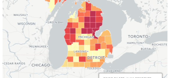
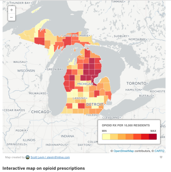
One thing that really jumped out to me was the power of visualization via the two state maps at the bottom of the article.
The first colors counties according to which have higher rates of opioid prescriptions being written. Keep an eye on the Detroit area (southeastern corner).
Now take a look at the second one, ranking counties according to number of deaths per 100K residents:
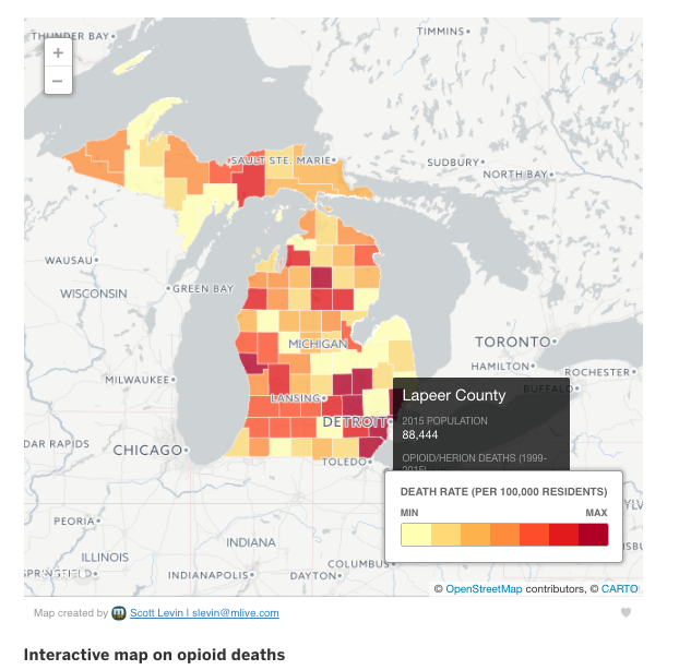
Are you still keeping an eye on Detroit? Notice how the death rate is highest in that area even though the prescription rate is among the lowest. (I do wish that instead of min/max, there were intervals marked instead, perhaps correlating the color scale according to the national death rates from opioids or something.)
This map helps us instantly see that there isn’t a natural mapping of higher prescription rates to higher death rates. As a result, it’s easy to have questions arise. Imagine discussing this with students:
- How is the death rate higher even if the prescription rate is lower? Where are the drugs coming from?
- Based on what you see here, which counties should the state of Michigan’s public health services target for interventions? Which kinds of interventions would be suitable given the prescription and death rate maps?
- What recommendations would you make for your own county?
- What additional information would you need to be able to answer these questions?