All posts by Martha Stuit

In the News: Internet privacy

In what ways do you limit your data sharing? Do you join or avoid loyalty rewards programs that track your habits? Do you block or regularly clean out cookies in your browser? Those steps are some areas where you have control over your information. Yet, data sharing to third parties is sometimes out of your hands or buried in the fine print of services that you use.

This last week, the Federal Communications Commission proposed new rules to give you a choice to opt out of data sharing to third parties by your Internet service provider. While this rule does not apply to sharing by websites, as critics point out, it does take a step toward consumer control of data sharing in the United States. It will be interesting to see what comes of this possibility!

Image: “Binary Map Internet Technology World Digital” by Pete Linforth on Pixabay. CC0 Public Domain. https://pixabay.com/en/binary-map-internet-technology-1012756/

Why care about data literacy? Check out these slides

Our team member Jennifer Colby, a teacher librarian at Huron High School in Ann Arbor, put together an informative presentation called “What is Data Literacy: Getting our students from data to knowledge.” In it, she expresses the importance of data literacy in classroom learning and gives four salient reasons, quoted from her slides:

  1. To develop literacy skills
  2. To develop standardized test taking skills
  3. To address state and national standards
  4. To develop informed citizens

Her slides highlight examples of how to approach data, statistics, and visualizations. Data literacy applies to all content areas. Take a look at the infographics on Romeo and Juliet — they give plot insights through their visual representations of events.

In the big picture, data literacy helps students with “understanding,” “extracting,” and “presenting” data. With so much data in school and everyday life, these competencies are key.

Keep her points in mind to incorporate data literacy into your instruction.

Visualization: The Stacked Area Chart

There are so many kinds of visualizations! Among them are stacked area charts — ever looked at or made one? Aside from their colorful visual appeal, they show information about items or topics in a category over time. They can be interactive or static.

One example of this type of chart is about causes of death. This visualization by Nathan Yau (of the website Flowing Data) reveals the prevalence of various reasons for death. It is organized by gender or race. Because it is interactive, the viewer can isolate a particular gender, race, or cause of death.

So what can you learn from this kind of visualization?

  • It gives a broad view of a topic. It can answer a question like, what are common causes of death for women? It cannot answer a question like, how many people die from external causes each year? (Some stacked area charts do give counts, though.)
  • It is ideal for making general comparisons. In addition to viewing percentage differences between the causes, you can see general patterns and trends, such as, how do men and women compare?
  • It can inspire more research. When you notice a trend, such as “external causes” as more prevalent at younger ages, it raises questions. What do “external causes” include? Why might that be a more common cause for young people? Go to the original data, as well as other sources of the same information, for more background and potential answers.

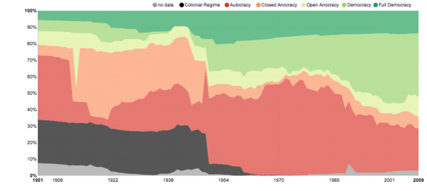
Other examples of this type of chart include one about political systems (pictured above) and what fills people’s time.

What stacked area charts have you encountered? Do you have a different “favorite” visualization?

Image: “The Shares of World Citizens living under different political systems – Max Roser” by Max Roser on Our World in Data. CC By-SA. http://ourworldindata.org/data/political-regimes/democratisation/