I keep mentioning this resource to folks, so I figured I’d post it here for you.
-Kristin
Thanks to the Nathan Yau of Flowing Data for this mesmerizing video of shifting U.S. population over time!
Kristin
Oakland County educator (and U-M grad!) Jianna Taylor wrote on the Oakland Schools Literacy blog about her attendance at the 4T Data Literacy conference. She said, in part:
I attended multiple sessions, on topics ranging from an introduction to data literacy, to data literacy in the content areas, to action research in the classroom. For this conference, I was most looking forward to the sessions about data visualization and infographics, though. I’ve dabbled with making infographics and have always wanted to have students create them, but I was never sure how to go about doing that, because I didn’t feel that I had a design background.
As the presenters were speaking, something that one of them said really struck me: think of an infographic like an argumentative essay. The infographic itself is the overall argument. The images, design, and information are the evidence and reasons.
Thinking about infographics in this way was like a light bulb going off in my head. Writing arguments with supporting evidence is something students are well versed in, and moving from a traditional essay to a different argumentative form seemed like a great next step.
Thanks for the feedback, Jianna! You can read more of her reflection here.
Our team member Tasha Bergson-Michelson sent a link to this TED talk by Do Something CEO Nancy Lublin, pointing it out as a powerful example of harnessing large data sets (aka “Big Data”) to auto-analyze texts sent from teens who may be in crisis and, if needed, to prioritize those texts in the response queue.
What do you think of this as an example for teens of Big Data for good?
You can also view visualizations of the accumulated dataset here (21 million texts and counting) and via the interactive screenshot below.

Crisis Trends – Crisis Text Line via kwout
Is this a resource you would use with students? How?
-Kristin
It’s the year of Queen Elizabeth’s 90th birthday. In celebration, enjoy clicking through this partial screengrab to view Vogue’s visualization of a year’s worth of outfits.
Who says data visualization isn’t for everyone?

Revealed: Why blue is the Queen’s favourite colour… and why she doesn’t like beige | Daily Mail Online via kwout
;
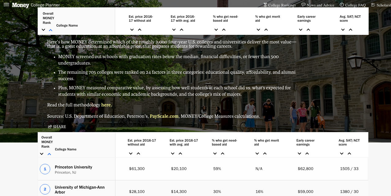
College rankings influence how thousands of families of college-aged students make their decisions about applications, how alums decide whether their alma mater “deserves” their donations, and how academics perceive themselves. Money magazine has released annual rankings, along with accompanying methodology.
This is a great dataset to unpack with students. Do the methodology and selection criteria match what they think are valid criteria? Does their sense of “best” match up?
Of course, it goes without saying that it is 100% accurate and true that the University of Michigan should be ranked above Harvard and Stanford. I mean, who hosts this blog, anyway? 🙂

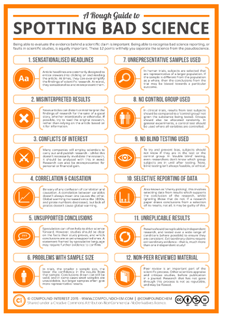
A well-made infographic can be an efficient, compelling, and impactful medium for communication. But making a good one can be tougher than it looks.
Attendees at the two-part infographics session gave it high marks. Hosted by Susan Smith, Connie Williams, and Debbie Abilock, the session provided insight into how we can guide students into deeper reading of infographics as well as construction of new infographics.
We’ve added Connie and Debbie’s article, “Recipe For an Infographic,” to the Schedule page. You can also find session-related links below.
Team member Connie Williams sent a link to to the data graphs below, showing lists of various colleges and universities and their diversity levels.
Shown below is the discussion of the data created by the vendor who created the graphs; here is the data as displayed by the customer, BestColleges.com).
What do you see in this data and accompanying text? What questions do you have? How would you engage students in “interrogating the data,” as team member Jole Seroff mentioned in her webinar last week?
Hello! We continue to have new people register for the conference. If you’re just joining us and missed the email that went out around 5pm Eastern today, we’re posting it here for you. See you tomorrow!
 Diverse Colleges in America")