Hello! The information below was sent to all participants who had registered as of 8:00am on Wednesday and posted here so any last-minute registrants don’t miss out!
All posts by Kristin Fontichiaro
We’re a week away from conference!
Hello! This email was sent to all who had registered for the conference as of July 7 and is posted here in case you missed it!
Remembering Future Shock’s Alvin Toffler
On June 27, Alvin Toffler, author of the book Future Shock, passed away. In reading about his life and works, this data-related quote jumped out at me.
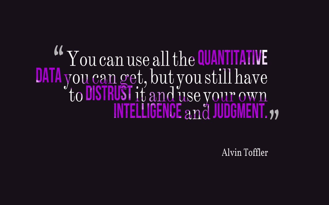
Do you agree?
We’re just a few days from our 4T Data Literacy free virtual conference. Join us!
-Kristin Fontichiaro
Image created at quotescover.com
Two Weeks Until Conference!
Hello! This message was sent to all registered participants. A few of you registered with email addresses that bounced back, so here it is for all! See you online soon!

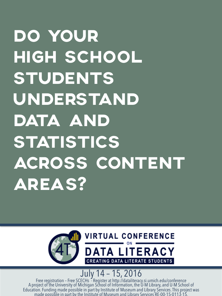
Registration is Open for the 4T Data Literacy Conference!
We are delighted to announce that registration is open for the free 4T Virtual Conference on Data Literacy!
Click here for a flyer you can download and share with colleagues.
Right-click/Ctrl+click on the image below to save it and share it on social media.
 .
.
Wind visualization
Not all visualizations show numeric data, our data visualization team expert Justin Joque reminds us.
Check out this visualization of wind across the U.S.
Enjoy!
Kristin
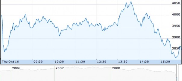
Webinar on Data Presentation
Do you ever wonder when to use a line graph, bar chart, or pie chart? Or how your data might look different depending on which kind of tool you use? Then you might be interested in data presentation, the process of deciding which tool to use and what elements to employ.
We are delighted to share the webinar below, hosted by Tierney Steelberg, with you. She’ll lead you through the kinds of questions you can ask yourself so you and your students can make charts, graphs, and tables that communicate more clearly and completely.
Enjoy!
Kristin
Image: “FTSE 100 modified” by Phil Gyford on Flickr. CC-BY-NC-ND-2.0.
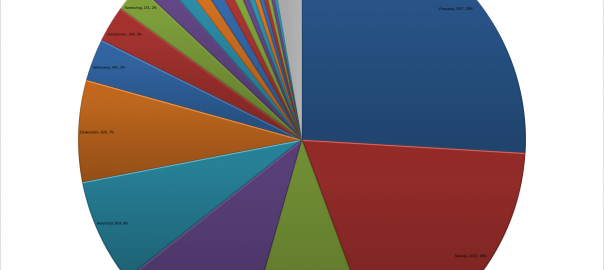
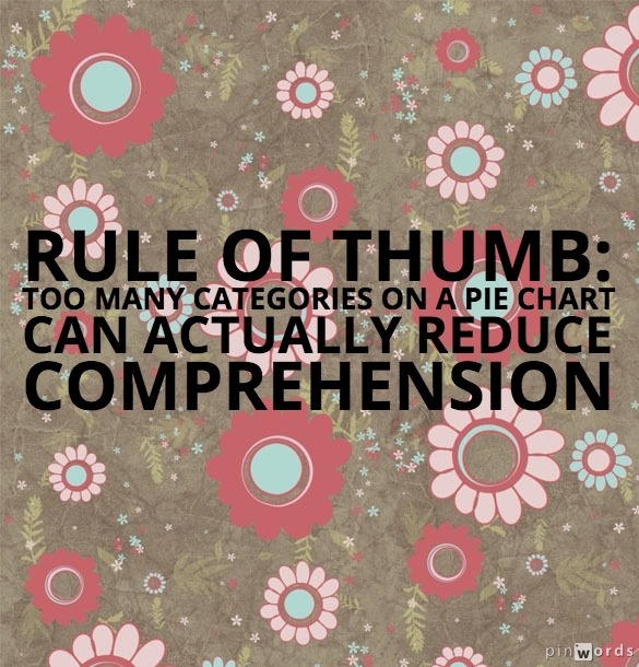
Data of the Day: Pie Slices!
Often, when students make pie charts, they end up with several very narrow slices. One thing we can encourage our students to do is think about what happens to their readers’ comprehension when the slices get so narrow that they’re almost impossible see.
Here’s a rule of thumb to consider:
Data of the Day: the power of small multiples (NYTimes)
Small multiples is a data visualization term referring to placing several small graphics (either all charts, all graphs, all maps, etc.), where the scale (axes, etc.) are the same but the data is different. Here’s a great example from the New York Times.
The presence of small multiples means we can track drought patterns over decades within a very small space, as shown in the clip below.
This can be a great accompaniment to a high school study of the Dust Bowl, for example.

h/t Justin Joque, University of Michigan Library
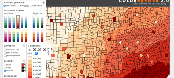
Looking for great map colors?
Our data visualization consultant Justin Joque of the University of Michigan library recommends Color Brewer as a site for choosing map visualization colors, taking into consideration what is color-blind safe or printer-friendly. Take a look!
Kristin