Category Archives: Data Visualization
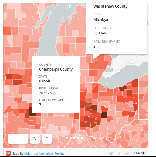
News Deserts
The Columbia Journalism Review has been assembling a national map showing “news deserts” around the United States. It’s utterly fascinating. In some states, like Nebraska, nearly half the state does not have a daily newspaper (or hasn’t reported one). How does that impact voting? Civic engagement? The sharing of local and beyond-local information among fellow citizens? What questions are raised when you look at it?
Mapping Opioids
(Note: this post first appeared at the Active Learning blog.)
First things first. You may have heard of the opioid crisis, but what is an opioid? I was surprised that when I went looking for a list of which prescription drugs are classed as opioids, it was somewhat tricky to find (my hypothesis is that some people know there’s an opioid crisis but don’t know that drugs like Percocet, morphine,OxyContin, and Vicodin are opioids, leading me to suspect that part of the problem is that some patients don’t realize that the drug they just got is an opioid).
Here’s what WebMD says:
 Pain Medications: Dosage, Side Effects, and More")
OK, now that we’ve got that background knowledge, let’s look at how visualizations about opioid prescriptions and fatalities in Michigan can yield some fascinating (albeit sobering) insights.
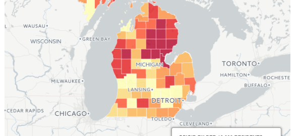
Julie Mack, with some graphics by Scott Levin, has a sobering article in MLive showing how opioid death has spiked in past years. In many counties, there were more opioid prescriptions written in 2015 than there were residents. (Of course, if opioids are dosed one month at a time, one resident’s year-long prescribed use would count as 12, right?)
One thing that really jumped out to me was the power of visualization via the two state maps at the bottom of the article.
The first colors counties according to which have higher rates of opioid prescriptions being written. Keep an eye on the Detroit area (southeastern corner).

Now take a look at the second one, ranking counties according to number of deaths per 100K residents:
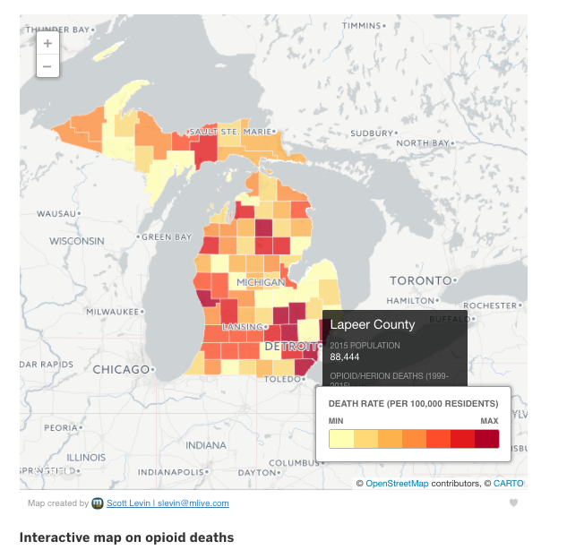
Are you still keeping an eye on Detroit? Notice how the death rate is highest in that area even though the prescription rate is among the lowest. (I do wish that instead of min/max, there were intervals marked instead, perhaps correlating the color scale according to the national death rates from opioids or something.)
This map helps us instantly see that there isn’t a natural mapping of higher prescription rates to higher death rates. As a result, it’s easy to have questions arise. Imagine discussing this with students:
- How is the death rate higher even if the prescription rate is lower? Where are the drugs coming from?
- Based on what you see here, which counties should the state of Michigan’s public health services target for interventions? Which kinds of interventions would be suitable given the prescription and death rate maps?
- What recommendations would you make for your own county?
- What additional information would you need to be able to answer these questions?
Axios Data Visualization on Uninsured
If you’re like me, you’re watching the both sides of the Congressional healthcare debates sling statistics, money, and tweets at one another. So I found last month’s mapped visualization by Axios to be mesmerizing in the way that it did one thing very well: show how the rate of uninsured Americans shifted under Obamacare/the Affordable Care Act. It doesn’t discuss issues of federal costs, personal expenses, or caliber of coverage, but it does a great job of showing one shifting variable over time: percentage of people with some sort of health insurance versus those with none at all.
The screengrab below shows a static image, but click through to the Axios site so you can see the interactive GIF and see the colors change across time.
Then ask yourself some data viz questions:
- Axios’ graphic measures by county. How might this look different if it measured by state?
- How does the color palette influence how you feel about the data? Would more emotional colors like blood-red impact your interpretation?
- Can you track back to the original data source (a division of the U.S. Census) and try out these questions?

Data Visualization: 2016 Election Data Down to the Precinct Level
Interested in data visualization? You might enjoy this mapping of the 2016 Presidential election at an unprecedented level of detail — the precinct level (not the county level) as posted by CityLab. Congratulations to Washington State doctoral student Ryne Rhola.


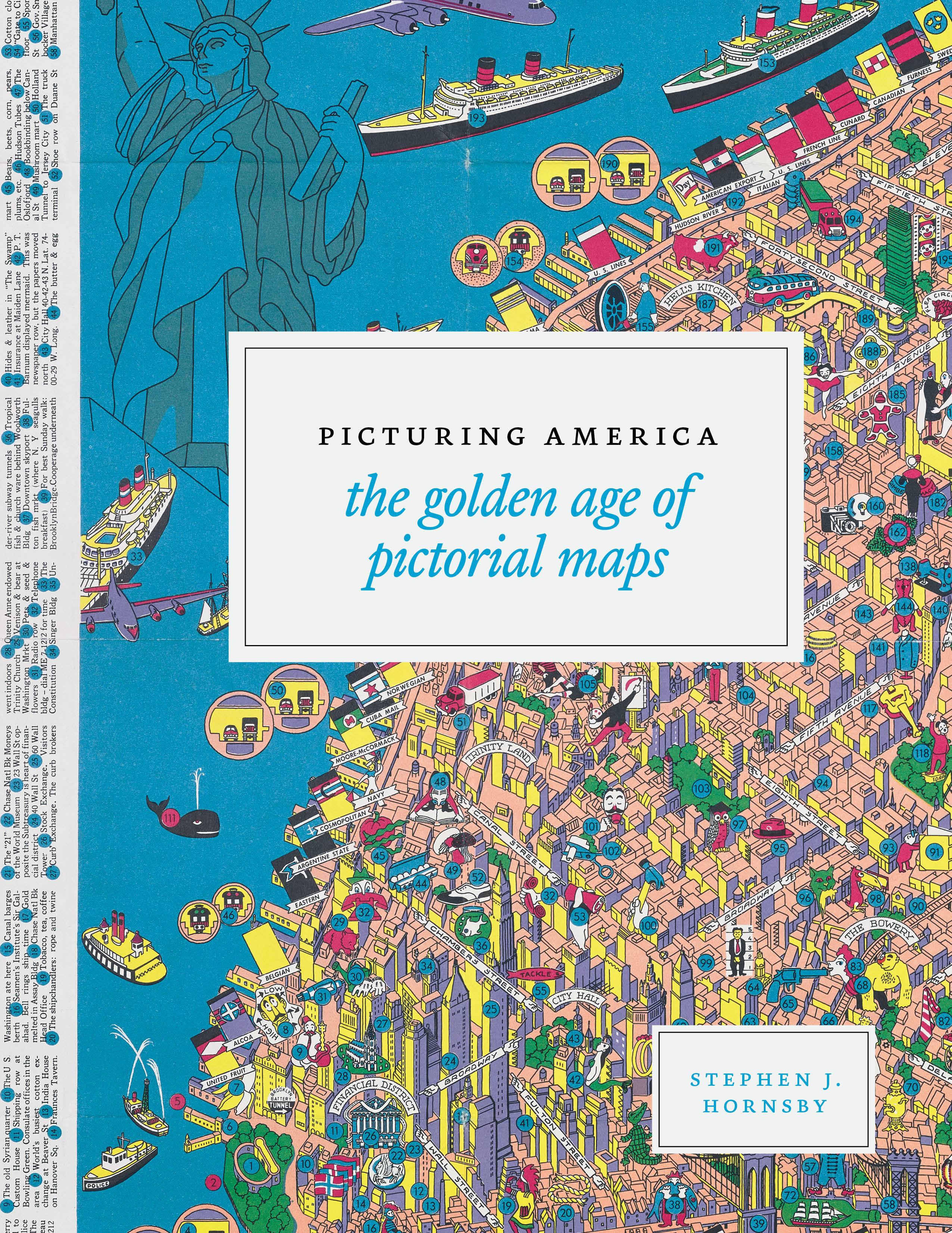
New Book: Picturing America: The Golden Age of Pictorial Maps

H.W. Hill & Co., Map of the United States, Showing the Farm Animals in Each State. 1878. Public domain. Image courtesy to the book by Rare Maps Inc.
Maps are a powerful, time-honored method of data visualization. And pictorial maps are even more fun, because they often superimpose iconography that represents the points of pride, natural wonders, exports, traditions, even the location of bathrooms. Think of historical maps complete with sea dragons or the state maps from the state reports of our youth, decorated with cars and sheaves of wheat.
The Library of Congress and the University of Chicago Press have a new book out to celebrate the decorated maps of our nation. Picturing America: The Golden Age of Pictorial Maps, was out this week, and just from the cover (below and in featured image) and preview pages I saw, I know I’m going to be hooked on these as soon as I can get my hands on a copy!
Data Literacy at MACUL!

Check out our team member Jen Colby’s presentation on data literacy at the MACUL conference this week! She got 60+ converts from this presentation … will you be next?
Speaking of conferences … save the date for the 2nd 4T Data Literacy Conference, coming July 20-21, 2017. Registration opens in a few weeks! Can’t wait? Our parent conference, the 4T Virtual Conference on impactful technology integration, is May 20-22, 2017. Register here!
Data of the Day (Data Visualization): Are you a #HamilFan?
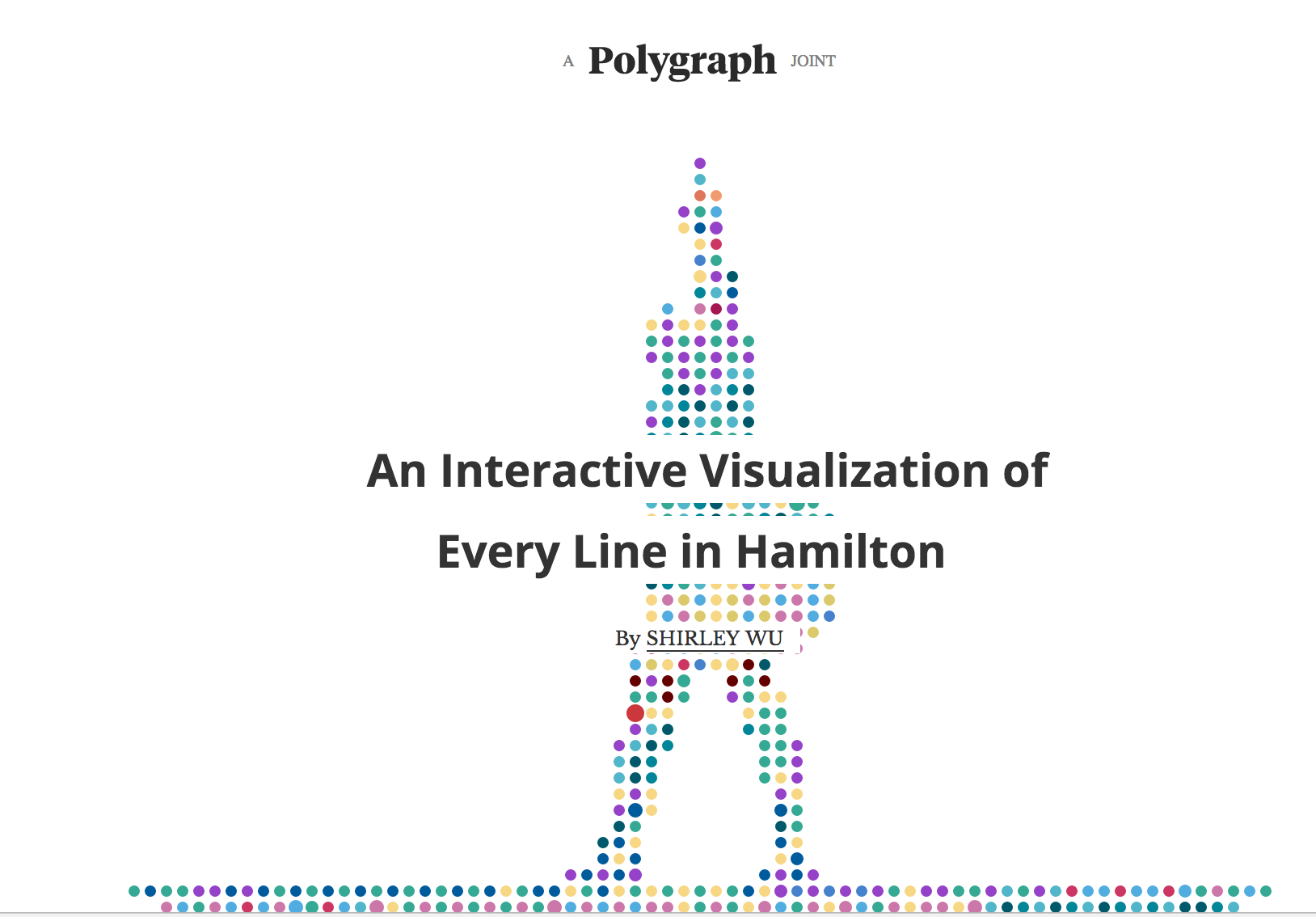
Check out Shirley Wu’s visualization of each line of lyric from the Broadway hit Hamilton (requires a lot of scrolling down).
Here are some possible discussion questions for your students:
- How does this visualization help you gain insight into Hamilton? What, if anything, gets in the way of gaining insight?
- How do colors help you understand Hamilton? How do they get in the way?
- What kinds of analysis are possible with this tool?
- One of the challenges of visualized data is that, unlike spreadsheet data, it cannot be automatically read aloud for those with visual impairments. How would you explain the tool to someone who cannot see the data? What would you add to the tool to make it more accessible for those with visual impairments?
- Overall, how do you rate the effectiveness of this visualization? Support your argument with examples from the visualization.
Hope this makes for a conversation that is nonnnnn-stop!
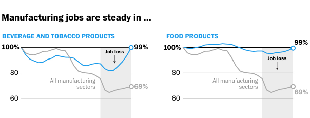
Washington Post: Fascinating Visualizations and Graphs About Manufacturing
The Washington Post has a fascinating series of maps and graphs about the state of manufacturing in the United States.
Here’s a snippet of one of them:
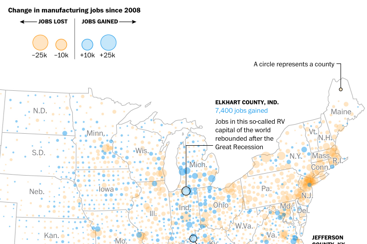
I love newspaper stories like this because you get a wide variety of maps, graphs, and other visualizations that students can use as jumping-off points for discussion and future inquiry.
Click through to take a look at the story, then come back here and think about these questions:
- Based on the data shown above, where might a manufacturing worker want to live to have a better chance at job openings?
- We keep hearing that the Rust Belt states are in terrible economic shape. Does the data above support that claim? What about other data visualizations in the article?
- In the story, compare the various market segment graphs. If you were a high school career counselor and were meeting with a student interested in manufacturing, which market sectors would you encourage her to pursue? Avoid?
- Which states would mostly likely respond better to a political candidate who promises to bring back manufacturing jobs? How does that compare to the election results of 2016?
- What does the sparsity of dots in the manufacturing maps in the West tell us about manufacturing there? What should we be careful not to assume based on those dots?
What else would you discuss with students?
Kristin
Mesmerizing Visualization of US Population Over Time
Thanks to the Nathan Yau of Flowing Data for this mesmerizing video of shifting U.S. population over time!
Kristin